
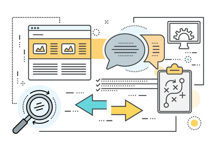
Web Design that Converts Visitors into Customers.
Is your website designed for conversions? Huh? We use the industry buzzword: “conversion” or “acquisition”, although you may be more familiar with the term “web lead”. Your conversion goal could be a newsletter sign-up, an app download, or a quote request. Either way, the goal of conversion-optimized web design is to nudge your visitors along the path of making direct contact with your organization. A well-designed website encourages your visitors to reach out to you directly (for example: by phone, form-fill, or e-mail). Fortunately, there are some simple techniques that will foster more conversions on your website.
Social Proof
Instead of proclaiming how awesome your company is, it is much more powerful if you let your customers say how awesome your company is. We used to call this a “testimonial”, now we’re calling it “social proof”. And it not necessarily because we enjoy using our fancy industry terms, but rather your customer’s praise (or scorn) is likely being shared across social media – hence “social proof”. If you have received a 5-star review on Google or Facebook, then be sure to display it on your homepage. This will give your visitors reassurance (social proof!) that you are an excellent company to deal with.
Trust Badges
Are you a member of an industry association or local chamber of commerce? Then display those logos on your website’s homepage. We call these “trust badges”. It reassures prospective clients that you are well connected and an authority in your industry. If you have high-profile customers, then let everybody know by displaying logos of your premier clients. Trust badges are another key step in the journey from prospect to customer.
Contact Forms
Are your contact forms scaring visitors away? Resist the urge to require 6, 7, or 8 fields of information. The more contact fields, the less likely that that your visitors will fill it out. Sure, it would be ideal if prospective clients provided all their details up front, but it’s not worth the risk that the form never gets submitted in the first place. Reduce the friction and make it easy for your customers to contact you.
Sticky Pop-Up Form
As your visitor scrolls down your webpage, your navigation bar should remain firmly stuck in place at the top. This way, your visitors can easily navigate from page to page. Another sticky trend in website design is to adhere a “pop-up form” on the side of the page. Using an unobtrusive little button, let your potential customers easily request a quote from wherever they are in your website.
Call-To-Action
What should your Pop-Up button say? We are seeing a trend away from a “Free Quote” button. Unless you normally charge for a quotation, then the phrase: “Free Quote” instantly diminishes the value of your offering. Even “Contact Us” is a better alternative. However, we are beginning to see softer, less pushy phrasing such as: “Let’s Get Started”. NetGain uses a button called “Work With Us”. You can try industry-specific too, a moving company might have a Call-To-Action (CTA) button that says: “Get Moving”. Your CTA should complete the sentence: “I want to …”
Get Converting!
Now it’s time for some introspection. Is your homepage missing testimonials and trust badges? Then it’s time to start thinking about a web refresh. Does your contact form have 11 fields? Then it’s definitely time for a website redesign. Read more about NetGain’s approach to website design here.
NetGain is a digital marketing agency located in Barrie, Ontario. Our team consists of graphic designers, web developers and communication experts. With a website designed by NetGain, you’ll quickly reap the benefits that our talented team can provide.