
The relevance of responsive web design has been steadily gaining importance in the development world thanks to a large increase in the number of mobile devices, notebooks, tablets and other devices becoming connected to the internet. Here are a few tips that you should consider when creating a responsive design for your website.
Media Queries
Media queries are very important when it comes to creating a responsive design. Media queries allow you to target a specific set of CSS rules based on screen size, display-orientation or even display density. This means that you can use a media query to target an iPad or a smartphone for example.
Here is an example of how this would look in your CSS:
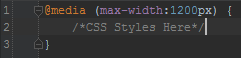
This will make a set of CSS rules take effect when the width reaches a width of 1200px or less.
Min-height, Max-height, Min-width and Max-width
These are exactly what they look like. They are used to specify the minimum and maximum dimensions that an element can occupy on a screen. You can combine this with the media query to target the width of any device you want.
Here is an example of this:
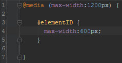
As you can see, we are targeting devices with a maximum width of 1200px, and we are making the chosen element half of the maximum width.
When Screens Are Too Small, Make Your Design Linear
When a screen gets to a particular size, it will become pointless to make elements display any smaller. The solution for this is to make all of the elements display at a width of 100% and line them up one after the other.
Make Your Layout Flexible
Flexible layouts are usually organized into columns, and are relatively sized rather than fixed. Having a flexible layout is a great way to be ready for any size of screen. How do you make a flexible layout? You set your element proportions in percentages rather than in pixels. If you want an element to take up half of the available width of the page, give it a width of 50%. It’s that easy.
You can throw all of these ideas together and get something like this:
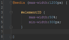
This will give you an element with a maximum width of 50% of the screen size that will never resize below 300 pixels that will only take effect when the screen is smaller than 1200 pixels.
There is a whole lot more that goes into creating a responsive design, but these are just a few tips to get you started on your way.